Neil
Carpenter

Design & front-end development

Blog

Sites

Collecting websites that have really impressed me, explaining what they have done to impress, and trying to work out what makes them tick.

Brandon Generator
www.brandongenerator.com

What's so good?

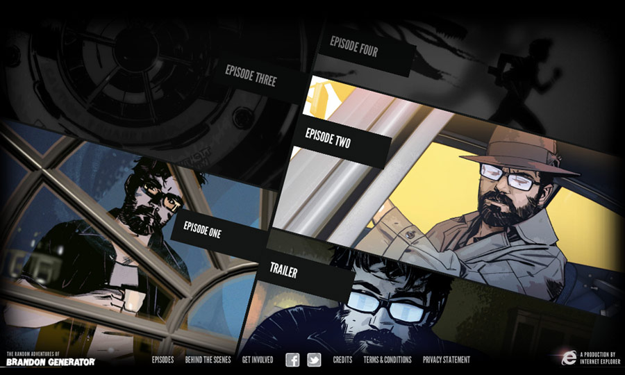
The Random Adventures of Brandon Generator is the latest in the line of IE-endorsed, Beauty of the Web sites looking to showcase the power of modern web technologies (or more specifically, IE9. Read my rant about this here). It is an interactive comic book-esque experience, of which there are already a few out there, but where this differs is that it really allows users to get involved and contribute.

It is credited as "By Edgar Wright, Tommy Lee Edwards & you", the emphasis is really about getting the viewers involved - you can submit a drawing, audio clip or message which may then be incorporated in to the story for the next episode, it's a great idea, and indeed is a great way to showcase modern web technologies (you can see a 'behind the scenes' write up here by the way, where LBi are credited with the development of the site).

The interactive elements, technology and user contribution is definitely impressive, but I just love the whole feel of the site - the illustrations, the story, the music, the narration. It's all a bit dark and surreal, really captivating. Looking forward to the next episodes.

Close
Stink Digital
stinkdigital.com

What's so good?

I had been eagerly anticipating Stink's new site after numerous visits to the temporary 'new site coming soon' page over the past few months, and they certainly haven't disappointed.

It's a really well designed site, and looks great, but it's the little details which I really appreciate - like the subtle fade-in transitions on each page, or that each work case study has a bespoke colour scheme to match the project artwork. In fact I love the use of bold, solid colours across the site, so simple yet so elegant. And I noticed something which I have never seen before, each area of the site has a custom :selection colour to match the relevant colour to that section - is this a groundbreaking feature? No. Will users likely even notice it? Probably not. But for me, it's these little attention to detail enhancements which really separate great sites from good ones.

And of course, the icing on the cake, it's responsive, NICE!

Close
Only Because We Can
www.onlybecausewecan.com

What's so good?

Yes, it's Flash. Yes, it takes a while to load up, but trust me, this site is worth it. Granted, I may have been slightly drunk when I first saw this, but it's still one of the most immersive, beautiful sites I have seen in a while (and that's in spite of the weird bit which makes you perv on the guy getting changed...), and gets better every time I view it.

Made by North Kingdom, you can see a case study and behind the scenes article on their site.

It is essentially an interactive film which allows users to pause on any frame and click on garments the models are wearing for further info. As I have mentioned before, I love a site which integrates music well, and this certainly does, and the whole thing looks so beautiful. But if I had to sum the site up in a word it would be seamless - the transitions between playing and paused video are so smooth, particularly the audio which will never be interrupted even when the video is, the lyrics will continue to play until a suitable place to pause, then fading in to a repeating background music loop.

Such a beautiful looking site, I love the design, I love the concept and I love the user experience, amazing!

Close
Reebok
www.reebok.com

What's so good?

Made by Hello Monday, this is an interesting take on a consumer goods site. No real 'navigation', just a search box, some filters, and an endless scrolling product page. You can see a write up on Hello Monday's site (That link is just to their site, I can't deep-link to the specific article unfortunately, Flash...).

The site uses AJAX to load in additional content for each item, and can add more content via an infinite-scroll type loading of content, both of which help create a really seamless browsing experience, no need for page refreshes. The 'search' navigation even works in real time, making the site feel super responsive and slick. It even has separate device versions of the site being served from the same codebase, very impressive. And on top of all that, it looks great.

Looking at the source I discovered a polyfill I haven't seen before - CSS3 PIE (the PIE stands for Progressive Internet Explorer), which "...makes Internet Explorer 6-9 capable of rendering several of the most useful CSS3 decoration features" could be using that in the future for sure.

Close
The Amazing Spiderman Game
www.theamazingspidermangame.com

What's so good?

Made by Soap Creative, described in their own words: The Amazing Spider-Man Game site was created to showcase the upcoming Activision game in all it's glory and deliver a rich experience with HTML5. Excelsior!

And it certainly is a rich experience, I think Dan Mall said it best on Twitter - I'm amazed this isn't Flash. The site looks great and is so smooth. I'm running it in Chrome and the transitions are literally seamless, full page background images with desaturation on hovering elements, no problem, and the blur/zoom-in transition between pages is awesome and I literally have no idea how it would have been done, I swear some console games don't have transitions that are as good looking/smooth as this, amazing.

Soap Creative really have some awesome interactive work to their name, I would highly recommend taking a look around their site, plenty of good stuff going on there.

Close