Neil
Carpenter

Design & front-end development

Responsive King’s

The skinny

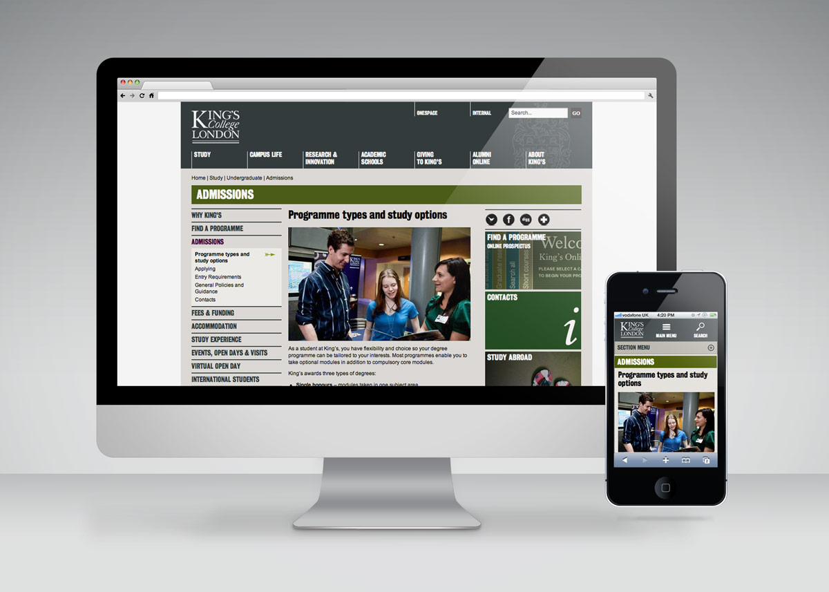
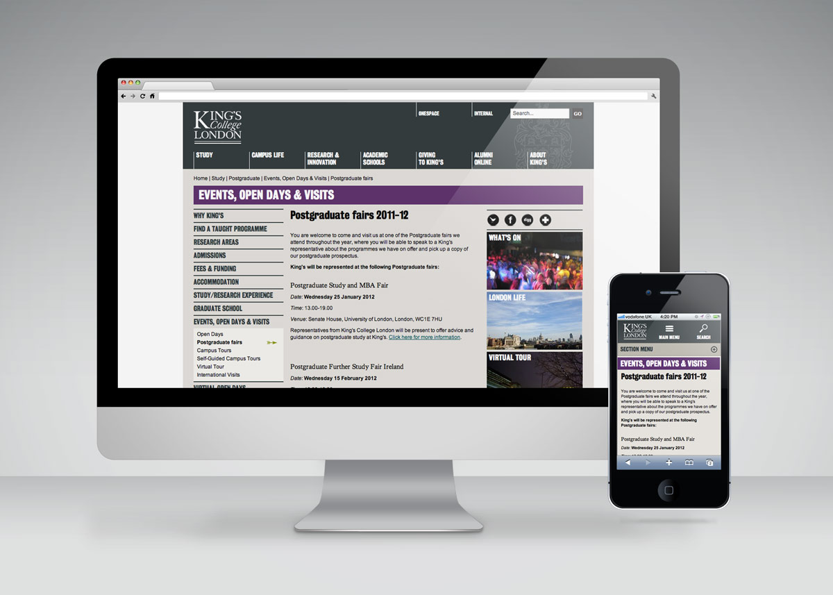
An experiment to see how easy adapting the King's College London website to display a mobile-layout below a specific screen width would be.

Visit site Smartphone demo

The not-so-skinny

Project overview

The King's College London website was redesigned in late 2010, and since then the opinion that a large institution like King's should have online content optimised for mobile devices has been growing in prevalence. Inspired by this article by Dan Cederholm I decided to tinker with the existing design to assess the possibility of retro-fitting the site with a responsive design.

Responsibilities

I took the existing front-end code from the most commonly used template on the site, and added extra code to create a mobile-layout below a specific breakpoint.

Technical deets

The design is technically an adaptive layout as opposed to responsive, as it remains in it's fixed width layout above 420px wide. There is a small amount of HTML added to the existing code to account for mobile menu buttons and lists, as well as one additional CSS and JavaScript file each. I also added a 'view full site' button which, when clicked, removes the additional responsive assets, sets a cookie (using jQuery cookie plugin) and reloads the page, I thought this may be a useful feature for a site being made responsive retrospectively, allowing existing users the greatest amount of control over their viewing experience.

Outcome

The experiment can be considered successful in that it works well, and has provided a solid grounding for any work going forward in to redesigning the site responsively. There are currently ongoing discussions in to the feasibility of implementing a responsive design across the entire site.

  • Responsive King's experiment
  • Responsive King's experiment
  • Responsive King's experiment

Share this